A lot of SMB leaders are sitting in the same spot right now. They have spreadsheets from payroll, notes from managers, open investigations, training logs, and compliance deadlines spread across different systems. The data exists, but when a termination decision, audit question, or manager conduct issue lands on the executive team's desk, nobody can quickly tell which facts matter most.
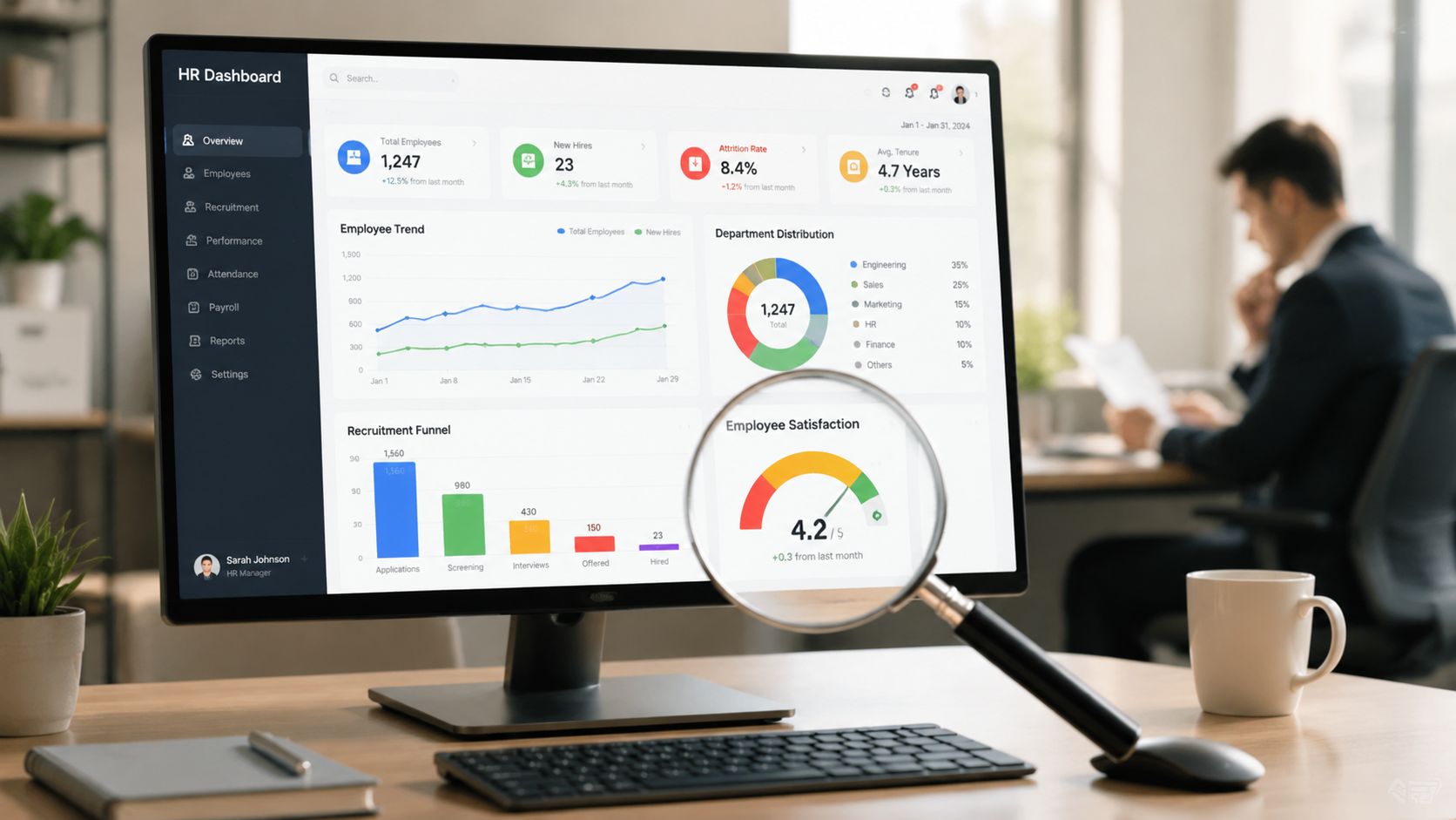
That's where dashboards and metrics stop being a reporting exercise and start becoming a decision tool. A good HR dashboard doesn't just show activity. It helps leadership see what needs action, who owns it, and what happens next if risk increases.
A COO opens a spreadsheet before a leadership meeting. One tab shows missing employee files. Another lists overdue training. A third tracks workplace complaints, but the dates are inconsistent and the status labels don't match. The team spends most of the meeting trying to understand the data instead of deciding what to do.
Now compare that with a single-page dashboard. It shows overdue investigations, documentation gaps, and upcoming compliance deadlines in one place. Instead of asking, “Where is the latest file?” the leadership team can ask, “Which issue requires escalation today?”
That difference matters more as organizations grow. The global reporting and dashboard software market was valued at $14.3 billion in 2025 and is projected to reach $33.65 billion by 2034, reflecting the growing importance of real-time metrics in complex business environments, according to Dataintelo's reporting and dashboard software market overview.
An HR risk dashboard gives leadership a structured view of a few critical issues that affect legal exposure, operational consistency, and manager behavior. In a multi-state or regulated business, that often means the dashboard is less about broad HR activity and more about defensibility.
Common examples include:
A dashboard earns its place when it shortens the time between seeing a problem and making a defensible decision.
Many teams think the problem is missing data. More often, the problem is unfiltered data. When every number gets equal attention, urgent risk indicators get buried beside routine operational details.
That's why dashboards and metrics need to work together. Metrics measure a specific condition. The dashboard organizes those measures so leaders can act without sorting through noise first.
Most confusion starts with the terms themselves. People use “dashboard” and “metric” as if they mean the same thing, but they don't.
A metric is a measurement. A dashboard is the place where selected metrics are organized so someone can understand a situation quickly. Think of a car. Your dashboard shows speed, fuel, warning lights, and engine temperature in one view. The odometer is one metric within that larger system.
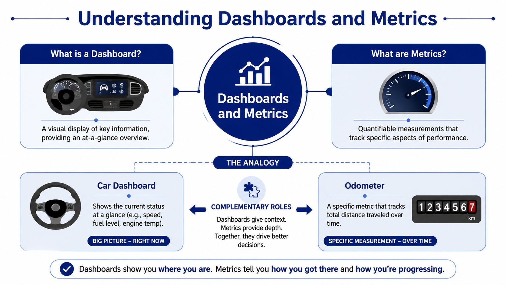
In HR, a metric might be document completion rate, time to fill, or investigation latency. Each one tells you something narrow. By itself, a metric doesn't tell a leader what to look at first or what tradeoff matters most.
For small businesses and SMEs, guidance identifies exactly 8 core metrics as the baseline set: voluntary turnover rate, 90-day turnover rate, time to fill, time to productivity, onboarding completion rate, headcount growth rate, offer acceptance rate, and HR admin time per employee, as outlined in FirstHR's guide to core HR dashboard metrics. That's a useful reminder that more numbers don't automatically create more clarity.
A dashboard places those measurements into a practical layout. It helps a leader answer questions like:
Many HR teams commonly deviate from the optimal approach. They build dashboards that collect interesting numbers rather than support a specific decision.
Only about a quarter of employees regularly use BI or analytics dashboards, and dashboards with more than ten metrics often dilute decision focus and fail to drive action, according to this dashboard adoption analysis.
Practical rule: If a number moves and nobody would change a decision, it probably doesn't belong on the dashboard.
Here's a quick comparison:
| Item | What it is | HR example | Why it matters |
|---|---|---|---|
| Metric | A single measurement | Training completion rate | Tracks one condition |
| Dashboard | A structured visual view of selected metrics | Executive HR risk dashboard | Helps leaders decide what needs action |
| KPI or KRI | A metric tied to performance or risk decisions | Investigation latency with escalation rule | Connects measurement to response |
For teams that are still building their foundation, this overview of essential people analytics for HR teams is a useful companion because it helps frame which workforce data belongs in decision-making and which data is just descriptive.
If your organization is moving from static reporting toward more forward-looking insight, it also helps to understand how predictive HR analytics fits into dashboard design. Predictive tools are most helpful when the core dashboard already has clean definitions and clear decision ownership.
Most leaders don't struggle with the idea of a dashboard. They struggle with scope. They ask whether the dashboard should cover recruiting, retention, compliance, investigations, and labor cost all at once.
Usually, the answer is no. A dashboard works best when it serves a clear audience with a clear decision purpose. That's why strong dashboards and metrics are selective, not exhaustive.
The hardest part of dashboard design isn't software selection. It's choosing metrics that can hold up when a regulator, attorney, auditor, or executive asks a direct question about why a people decision was made.
A defensible KPI does more than describe HR activity. It tells leaders when to act, what threshold matters, and what response follows. Without that structure, the dashboard becomes a passive report.
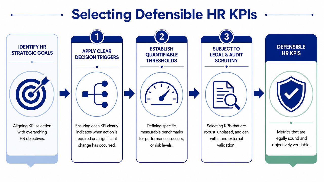
Start with three questions.
ERM frameworks require every Key Risk Indicator to have both a quantifiable threshold and a plain-language decision rule, transforming dashboards into active risk mitigation systems, as described in this ERM dashboard guidance.
Take manager conduct investigation latency. Many teams track open investigations, but the raw count isn't enough. A count tells you workload. It doesn't tell you whether the organization is exposing itself by moving too slowly.
A defensible version of that KPI would include:
That structure changes the metric from a historical note into an operating rule.
If the number can rise for weeks without a required response, it's not yet a risk KPI. It's just a number on a screen.
Some metrics are useful for HR management but weak for HR risk. Broad engagement summaries, generic satisfaction indicators, or dashboard widgets added because they “look complete” can distract from the issues that shape defensibility.
The safer approach is to choose fewer KPIs with stronger decision links. For leaders who want a broader view of performance-oriented measurement, this guide on how to boost productivity with KPIs can help distinguish general operating metrics from the narrower set you'd feature on a high-stakes HR dashboard.
Use this filter before approving any KPI:
| Question | Strong answer | Weak answer |
|---|---|---|
| What decision does it support | Termination, escalation, audit readiness, staffing response | “General awareness” |
| What threshold matters | A defined trigger point | “We'll know it when we see it” |
| What happens next | Assigned action and owner | No response protocol |
| Can leaders explain it clearly | Plain language, consistent definition | Vague label or changing interpretation |
When a KPI passes all four lines in that table, it's much more likely to support a defensible HR process instead of adding clutter.
Even strong KPIs can fail inside a poorly governed dashboard. If leaders don't share the same definitions, can't tell when data was last updated, or see different versions of the same metric across states, the dashboard creates confusion instead of control.
That's why design and governance belong together. Design determines what people see. Governance determines whether they can trust it.
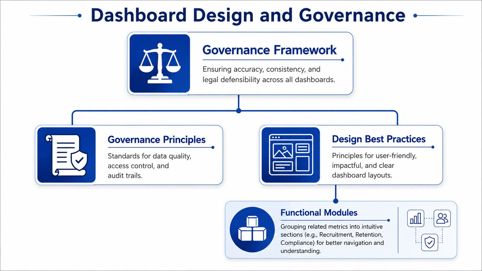
For executive-level HR risk dashboards in multi-state settings, the standard is to limit the view to 12 to 20 total metrics grouped into exactly 4 to 5 functional modules such as cost, talent flow, manager execution, and risk, with a single-page summary and drill-down capability, based on EESI's HR dashboard metrics guidance.
That structure matters because executives need a fast scan first. They can drill deeper later. A dashboard that opens with too many competing visuals usually hides the issues leadership most needs to see.
A practical layout often works like this:
A common mistake is assuming every metric means the same thing everywhere. In reality, a term like “termination,” “active employee,” or “completed investigation” may need tighter internal definitions when states apply rules differently.
Current content coverage leaves a major gap here. Zero percent of existing content covers locking down shared metric definitions across states with version dates, despite how necessary that is when employment laws diverge, according to European Business Magazine's discussion of dashboard design gaps.
That gap has real consequences. If one region counts a status one way and another region counts it differently, leadership may think they are comparing like with like when they are not.
A durable dashboard needs a few basic controls:
Governance reminder: A clean visual doesn't make a dashboard reliable. Shared definitions do.
Here's a practical sequence:
| Layer | What belongs there | Why it matters |
|---|---|---|
| Definitions | Metric names, formulas, scope rules | Prevents inconsistent interpretation |
| Thresholds | Trigger levels and alert logic | Converts observation into action |
| Permissions | View and edit roles | Protects core logic |
| Review process | Scheduled checks and approvals | Keeps the dashboard current |
When teams handle design without governance, dashboards tend to look polished but break down under scrutiny. When they handle governance without design, leaders avoid using the dashboard because it feels too dense. You need both.
The best way to understand dashboards and metrics is to see how they work in different operating environments. The right dashboard for a professional services firm won't look exactly like the right dashboard for a healthcare practice or a multi-state field operator.
What stays consistent is the decision logic. Each dashboard should help leaders answer, “What changed, what does it mean, and what must we do now?”
A growing professional services company often starts with talent flow and basic workforce stability. Leadership doesn't need a complicated risk console yet. They need visibility into whether hiring and early retention are working.
A practical dashboard here might include the core SME metrics already discussed, with special attention to voluntary turnover rate, 90-day turnover rate, time to fill, and onboarding completion rate. If time to fill starts stretching beyond the market benchmark of 36 to 42 days, leaders can review recruiting process delays against the benchmark noted in Subscribe-HR's HR dashboard example guide.
This type of dashboard supports decisions like:
A multi-state business has a different problem. It usually isn't a lack of data. It's uneven execution across locations, managers, and compliance routines.
Here, the dashboard should prioritize document status, required training completion, investigation timing, and issue escalation. The most important feature is that each metric ties to a defined action when it crosses a risk line.
Compliance dashboards must enforce a Document Completion Rate target of 98% or higher, with escalation rules triggered if it falls below 95% to create an audit-ready trail, according to OEM America's HR compliance metrics guidance.
A dashboard in this setting might present:
When a compliance metric falls below its threshold, the dashboard should change behavior, not just color.
A healthcare practice often needs a narrower but stricter dashboard. The issue isn't broad people analytics. It's whether leaders can prove that required steps happened on time, with the right documentation, and under consistent supervisory control.
In this case, the dashboard may emphasize audit readiness, role-specific training, corrective action tracking, and manager execution. The strongest version keeps the summary page short and gives practice leaders drill-down access only when an alert appears.
Typical decisions driven by this dashboard include:
The industries differ, but the operating pattern is the same.
| Business type | Primary dashboard purpose | Example decision |
|---|---|---|
| Professional firm | Talent flow and early workforce stability | Adjust recruiting or onboarding process |
| Multi-state operator | Compliance consistency and risk escalation | Trigger HR operations follow-up |
| Healthcare practice | Audit readiness and controlled execution | Pause action until documentation is complete |
The lesson is simple. A useful dashboard reflects the decisions your leadership team makes. It shouldn't try to be a warehouse for every HR number in the business.
Many dashboard projects fail for a simple reason. Teams build the screen before they build the decision logic. That usually leads to a polished report that nobody trusts or uses.
The warning sign is common. Ninety percent of dashboards are never used because they lack tied decisions, creating hidden waste in HR compliance reporting and audit preparation, according to this analysis of dashboard adoption failure.
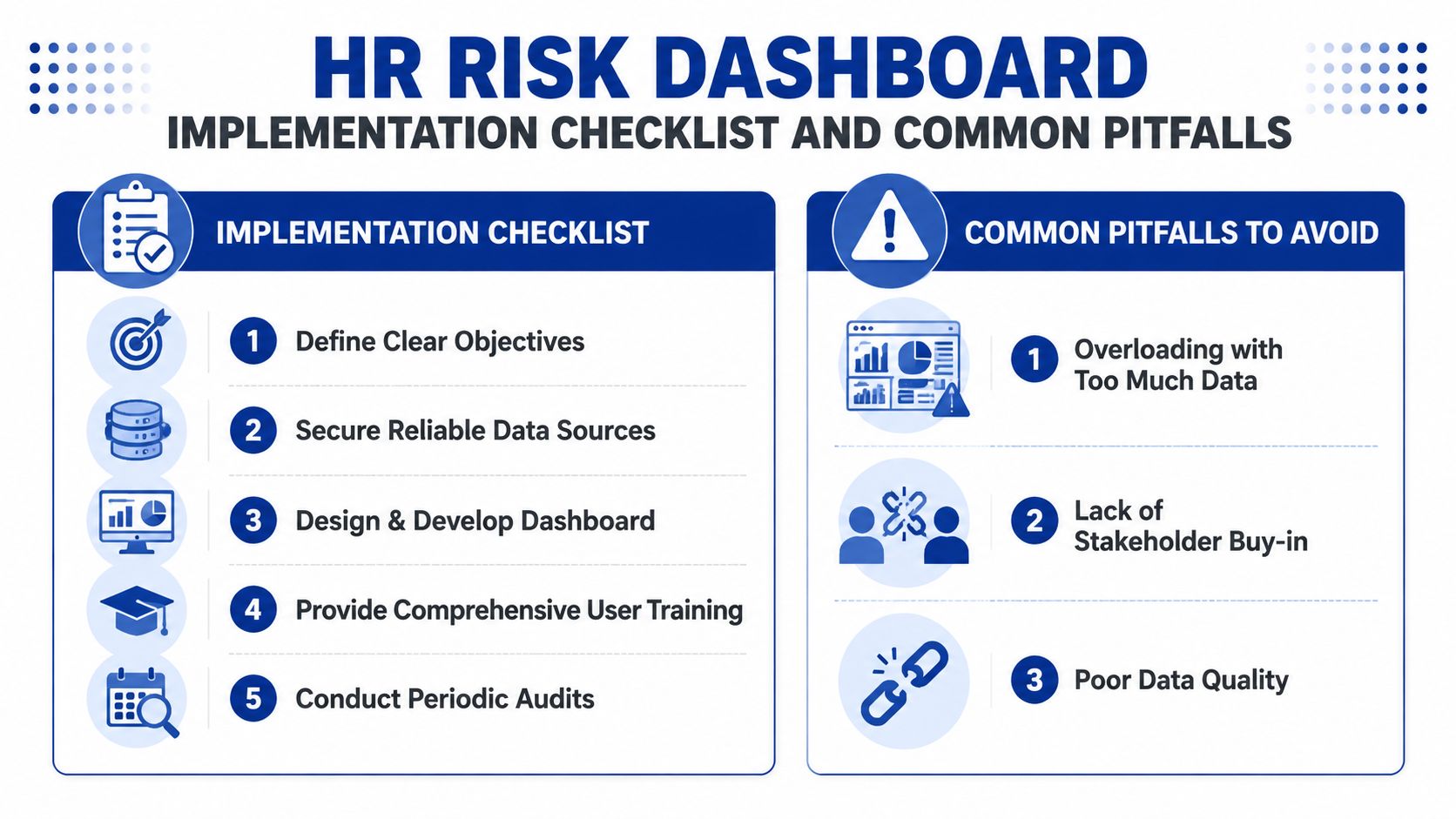
If you're implementing an HR risk dashboard, move in this order.
For organizations building a more formal control structure, this human resources risk management template can help map dashboard content to operational ownership and risk review routines.
Some problems show up again and again.
A quick reset often works better than a full rebuild.
| Problem | What it looks like | Better move |
|---|---|---|
| Vanity metrics | Interesting but low-action data | Remove anything that doesn't change a decision |
| No decision rule | Red status with no next step | Add an owner and escalation action |
| Definition drift | Different teams count differently | Lock definitions and track version dates |
| No ownership | Stale dashboard, unclear edits | Assign one accountable owner |
One test worth using: Ask whether any metric changed a termination, investigation, or compliance choice in the last month. If the answer is no, revisit the metric.
A dashboard doesn't need to be perfect at launch. It does need to be useful, disciplined, and tied to real leadership actions.
It is the first Monday of the month. A manager sees a red flag on the HR dashboard, but no one is sure whether the threshold still fits current policy, whether the definition changed last quarter, or who is supposed to act. At that point, the dashboard has stopped being a decision tool and started acting like a wall chart.
That is why monitoring cadence matters. In regulated and multi-state environments, each metric should trace to a real decision, such as opening an investigation, reviewing a termination path, escalating a leave issue, or checking whether a policy control failed. If that decision path is no longer clear, the metric needs review.
A useful schedule works like routine equipment maintenance. You do not inspect every part every day, but you also do not wait for failure. Review the items tied to active compliance exposure more often, and review strategic indicators on a slower cycle.
For many SMB teams, this cadence is practical:
One question keeps these meetings honest. Which decisions changed because of this metric?
If leaders cannot answer, the metric may be interesting but not defensible.
Continuous improvement is usually a series of small corrections. A threshold produces too many false alarms, so the team resets it. A turnover measure means one thing in one state and something slightly different in another, so HR locks the definition and records the version date. A dashboard tile gets attention in meetings but never changes a staffing, compliance, or investigation decision, so the team removes it.
The best feedback often comes from the people closest to the decision point. Ask HR, legal, operations, and frontline managers where they hesitate, where they override the dashboard, and where they need clearer escalation rules. Those moments show you whether the dashboard supports judgment or just displays numbers.
If your team is building a stronger review process, this guide to continuous compliance monitoring helps connect dashboard reviews to a broader control system.
The long-term value of an HR risk dashboard comes from disciplined review, stable definitions, and visible links between each metric and the action it is meant to support.
If your team needs help building dashboards that hold up under real employment decisions, our firm works with SMB leaders who need structure, defensible metrics, and clear governance in complex HR environments. You can learn more about the advisory approach and start a conversation through the contact page.